Blogs


Wellpop
Admin / Mar 10, 2026Introduction
Wellpop is an emerging Indian B2C wellness brand operating in the FMCG functional supplements space, with a clear focus on turning wellness into an enjoyable, consistent daily habit. Their hero product, the chewable gummies, combines scientific credibility with snackable joy, tailored for the modern urban lifestyle.

Brand Type
Consumer Wellness | Functional FMCG | Direct-to-Consumer Wellpop straddles the emotional territory between healthcare and lifestyle, offering a new-age alternative to intimidating, performance-heavy supplements.
The Challenge
To craft a visually disruptive yet credible identity for a wellness product that delivers clinical-grade results in a playful, habit-forming format. The identity had to strike a fine balance, credible yet fun, modern yet nurturing, disruptive yet trustworthy, while resonating across genders in an already cluttered supplements market.
Our Approach
We began by identifying two key archetypes:
● Jester – to bring playfulness, approachability, and habit-forming delight
● Caregiver – to root the brand in trust, well-being, and gentle empowerment
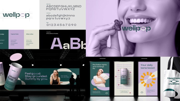
The identity system centers around a distinctive elliptical twist in the 'O' symbolizing the daily “pop” of vitality. Combined with a deep green primary color and a complementary lavender accent, the system balances modern wellness with playful disruption.
Typography choices (DM Sans + Birds of Paradise) were selected for clarity, warmth, and charm, allowing tone to shift from functional to aspirational across formats.

Brand Language Extension: From Identity to Experience
The identity was not limited to the logo; it was extended across all key brand touchpoints to create a cohesive and immersive wellness experience:
1. Packaging Design
● Tubes and sleeves were designed with a gradient-led calming visual language from Japanese Indigo to Tropical Violet.
● Clear product segmentation (Mood Support, Sleep Support, Bone Boost) with concise, benefit-driven copy.
● Use of playful yet reassuring microcopy (e.g., “Sleep like you mean it”) reflected both archetypes.

2. Website & E-commerce Experience
● The brand website features large-format typography, pill-shaped icons, and a clean, breathable layout.
● Messaging pillars such as “Happiness now chewable” and “A joyful twist to wellness” were integrated across banners, product pages, and CTAs.
● A cohesive tone from educational to empowering runs throughout the user journey.

3. OOH & Poster Collaterals
● Designed as bold, vibrant displays with benefit-first language: “Revitalize nights and recharge life” or “Start strong. Stay calm daily.”
● Visuals mix lifestyle photography with abstract elliptical elements from the logo, creating a recognizable visual signature.

4. Merchandise & Digital Icons
● Tote bags, app icons, and watch wallpapers all use the elliptical symbol as a standalone emblem, allowing for minimalist recognition.
● Messaging like “Feel good. Stay grounded. Gummy by you.” bridges functionality and friendliness.

The Output
The result is a scalable, memorable, and emotionally resonant identity system that:
● Reframes supplements as chewable lifestyle rituals
● Builds consumer trust through minimalist design
● Allows for flexible product extensions (e.g., sleep, mood, energy support)
● Reflects the future of joyful health in the FMCG space
Conclusion
Wellpop’s identity doesn’t just look good; it works. It aligns visuals with values, science with smiles, and products with people. For a wellness brand that dares to twist the norm, we’ve built a brand system that pops visually, emotionally, and commercially.