Blogs


The Kaizen Brand Story
Admin / Mar 10, 2026Kaizen House of Power set out to build more than a gym; it aimed to create a performance-driven environment rooted in discipline, growth, and consistency. The objective was to develop a brand identity that feels powerful, structured, and aspirational, while remaining accessible to a growing fitness community.
Hybrid Inks Studio was entrusted with building a complete identity system, from the logo and stationery to merchandise, environmental branding, and communication touchpoints.
The Challenge
Most fitness brands rely heavily on loud visuals and aggressive messaging. Kaizen needed something different — a brand that reflects:
- discipline over hype
- long-term growth over short-term motivation
- community over intimidation
- structured performance over chaos
The identity had to work across multiple real-world applications, gym interiors, billboards, apparel, menu cards, and digital communication, while maintaining visual consistency.
Strategy & Thought Process
The brand direction was rooted in the philosophy of Kaizen — continuous improvement through discipline and consistency.
In a space filled with loud, repetitive gym visuals, the focus was to create something structured, minimal, and distinctive. The strategy centred on building a brand that feels strong without being aggressive and premium without being intimidating.
A key decision was to make the logo the foundation of the identity. Instead of being just a symbol, it needed to carry meaning, build recall, and work seamlessly across every touchpoint from apparel and communication to large-scale branding.
When the core is strong, the brand naturally feels consistent.

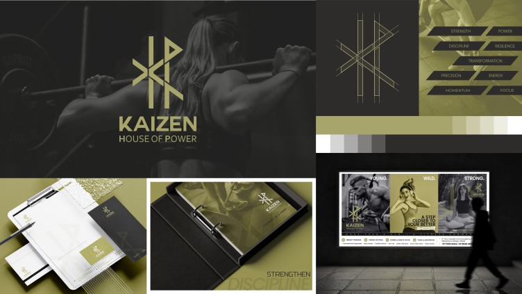
Logo Concept
The Kaizen logo was designed as the identity anchor, a mark that represents strength, focus, and continuous progress without relying on typical gym visuals.
Key symbolic cues:
- Balance & symmetry - discipline and control
- Angular geometry - strength and performance
- Upward orientation - growth and improvement
- Minimal wordmark - clarity and confidence
The gold-accented palette reinforces achievement, prestige, and aspiration within the fitness ecosystem.

By moving away from common fitness symbols, the logo gives Kaizen a distinct and recognisable presence. More than a design element, it becomes the thread that ties the entire brand together.
Identity System & Applications
1. Merchandise & Apparel From hoodies and training tees to gym bags and accessories, the identity adapts into wearable branding that feels aspirational rather than promotional.
2. Environmental Branding Billboards and signage translate the identity into bold, high-visibility formats, communicating energy, performance, and confidence.
3. Communication Touchpoints Stationery, posters, and promotional graphics maintain a structured design language, ensuring recognition across platforms.
4. Gym Menu & Experience Design The gym menu card introduces a lifestyle extension, connecting fitness with nutrition, performance fuel, and everyday discipline.

Impact
The Kaizen identity moves beyond aesthetics to build a performance-led brand environment. It allows the gym to:
- stand apart from typical fitness branding
- create a recognisable visual system across touchpoints
- communicate strength without aggression
- build a premium yet community-friendly perception
More importantly, it positions Kaizen not just as a fitness centre, but as a place where transformation is structured, consistent, and intentional.
Conclusion
Branding Kaizen House of Power was about translating a mindset into a visual language. Every element — from the logo to the merchandise and billboards — works together to reinforce one idea:
Strength is built daily. So is identity.
This project reflects Hybrid Inks Studio’s approach to branding, where strategy shapes design, and design builds experiences that people grow with.