Blogs


Visual Identity - NCPA Summer Fiesta 2025
Admin / Nov 18, 2025Designing the Spirit of Summer : How Hybrid Inks Studio Shaped the Visual World of NCPA Summer Fiesta 2025
Spanning from April to July 2025, the NCPA Summer Fiesta is not just an event, it’s a stage for young minds to explore, express, and evolve. Curated by the National Centre for the Performing Arts, this annual festival invites children aged 4 to 19 to experience a vibrant mix of theatre, dance, storytelling, stand-up comedy, puppetry, debate, and content creation. Each workshop is more than just a session, it’s a journey of creativity, confidence, and collaboration.
Our Role: Weaving the Visual Language
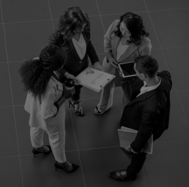
As creative partners to this cultural celebration, Hybrid Inks Studio had the privilege of defining and executing the design language that would set the tone for the entire campaign. From concept to completion, we crafted a cohesive visual narrative that would engage both kids and parents, on-ground and online.
What began as a few bold, colourful strokes evolved into a fully-realized visual ecosystem that touched:
- Promotional Materials – Posters, brochures, flyers
- Digital Media – Social media posts, stories
- Print Collaterals – Magazine ads, standees, event certificates, banners, flexes
Every element reflected the dynamic energy of the fiesta, stitched together with joyful scribbles, hand-drawn motifs, and a palette inspired by the Summer Fiesta 2025 logo itself. This wasn’t just a look, it was a feeling, repeated consistently and memorably across all touchpoints.

The Theme: Where Creativity Meets Childhood
We began by building a design language inspired by childhood spontaneity - think messy scribbles, abstract cutouts, sunbeams, and playful colour blocks. These elements were never just decorative; they carried meaning:
- Doodles and swirls expressed creative chaos, mirroring the energy of a young performer.
- Geometric overlays anchored the layouts while still feeling hand-made and fluid.
- Soft yet vibrant colours were derived from the Summer Fiesta logo itself, allowing the campaign to feel visually rooted and instantly recognizable.
This style formed the foundation of every asset ensuring consistency while leaving room for joy.

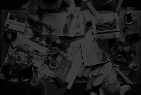
Bringing It Alive Across Formats
We carried the theme into a variety of assets, from large-format posters and brochures to certificates, digital stories, and animated reels. Each creative had a job: to pull attention, build excitement, and convey information clearly. Yet no matter where the viewer engaged, they felt they were entering the same vibrant, magical world of Summer Fiesta.

Whether it was:
- A child spotting the poster on a school notice board,
- A parent engaging with a story on Instagram, or
- An attendee receiving a certificate at the end of a workshop
they all felt part of the same narrative.

The Outcome: More Than a Campaign
While the visuals spoke loudly, the biggest outcome for us was more human - client satisfaction, audience connection, and the trust we earned. For a studio like Hybrid Inks, working with NCPA, a national icon in the performing arts space was a milestone in itself.

It wasn’t just about delivering assets. It was about understanding the emotional pulse of the event and building designs that mirrored its heart.
Final Word
Summer Fiesta 2025 gave us the perfect platform to merge our design philosophy with a cause we believe in nurturing young creativity. At Hybrid Inks Studio, we believe great design is never just visual; it’s experiential.

And with this project, we didn’t just create art, we created stories that danced across every stage, screen, and spotlight of the fiesta.