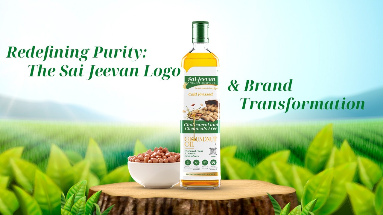
Redefining Purity: The Sai-Jeevan Logo & Brand Transformation
At Hybrid Inks Studio, we believe that every brand’s identity must evolve in tandem with its purpose, audience, and aspirations. Our recent collaboration withSai-Jeevan Premium Cooking Oilis a testament to how thoughtful design can redefine perception while staying rooted in authenticity.
From a Drop to a Deeper Meaning
Sai-Jeevan’s original logo carried a drop symbol directly, but was limited in its narrative. When tasked with revamping the identity, our vision was to go beyond a product-focused symbol and capture the essence of what the brand truly stands for: health, purity, vitality, and family care.
The new logo integrates a human figure with a refined wordmark. The upward motion symbolizes wellness and energy, while the golden figure conveys nourishment and trust. The green backdrop represents natural goodness, instantly aligning with the brand’s promise of “Purity & Health in Every Drop.”
This shift marked a transformation from simply showing “oil” to showcasinglife, care, and reliability.
Extending the Design Language
Redesigning the logo was only the beginning. To create a cohesive brand presence, we carried the identity forward across multiple touchpoints:
●Website Content & Design:A clean, user-focused layout that highlights the product’s purity, usage benefits, and quality promise.
●Social Media Presence:Posts designed to educate, engage, and inspire, building a community around healthy living with Sai-Jeevan.
●Packaging Exploration:Concepts aligning with the premium positioning of the product, ensuring shelf visibility and customer recall.
●Communication Collateral:Consistent brand visuals across print and digital formats to strengthen recognition and trust.
Our Design Approach
Colour Psychology:We chose agreen-golden paletteto reflectnatural purity, vitality, and premium quality. Green stands for freshness, health, and trust, while golden accents add a sense of richness, nourishment, and care, echoing the brand promise of“Purity & Health in Every Drop.”
Typography & Style:The serif font was selected to maintain a balance of elegance and reliability, while ensuring strong legibility across packaging, digital platforms, and retail presence.
Cultural Essence:The overall look and feel connect with Indian household values of care and tradition, while positioning Sai-Jeevan as a modern and premium choice for conscious consumers.
Building Trust, Not Just Visuals
For us at Hybrid Inks Studio, this project was not only about design but also about trust building. A premium cooking oil brand like Sai-Jeevan deserved an identity that communicates reliability while standing out in a competitive market.
The outcome was more than a refreshed look; it was a renewed story, one that resonates with audiences and strengthens the brand’s long-term vision.