Blogs


Brand Identity - The Puzzle.Co
Admin / Nov 18, 2025Bringing Joyful Learning to Life with The Puzzl.Co : A Branding Case Study
"Transforming Puzzles Through Playful Branding and Creative Learning"
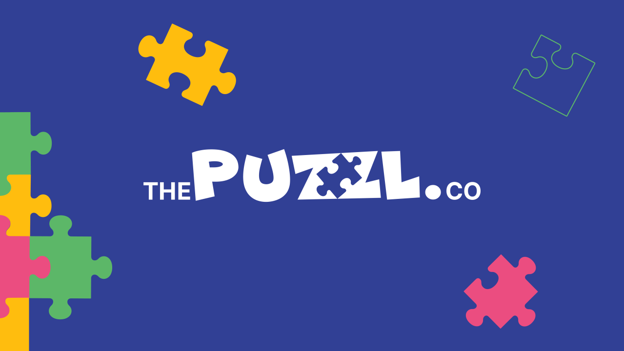
Logo Design: Puzzl-ing Together Fun and Learning :
At the heart of The Puzzl Co's vibrant brand identity lies its iconic logo. Designed by Hybrid Inks Studio, the logo features a playful jigsaw puzzle piece seamlessly integrated into the letter Z, symbolizing the brand's commitment to blending fun with cognitive development. The choice of vibrant blue hues and dynamic typography in Inter font ensures the logo appeals to children aged under 8, fostering an immediate connection through visual storytelling.

The logo creation process involved meticulous attention to detail, with grid lines and slanted elements strategically encompassing the "The Puzzl.co" name. The emphasis on the word "Puzzl" with a larger font size compared to "The" and "Co" underscores the brand's playful nature while maintaining readability and impact. The use of Inter font further enhances the visual appeal, showcasing uppercase, lowercase, and digit variations designed to resonate with young audiences.
Colour Palette: Inspiring Creativity with Every Hue
The primary color palette of The Puzzl Co is anchored by a lively Blue (Pigment) that stimulates creativity and concentration, complemented by Light Medium Orchid and Mikado Yellow. Additional colors like Emerald, Halloween Orange, and Steel Grey add versatility, allowing for diverse thematic expressions across products and marketing materials.

Each colour was chosen not only for its vibrancy but also for its ability to evoke different moods and themes within the puzzles. For instance, Emerald and Halloween Orange lend themselves well to adventurous themes, while Steel Grey provides a sophisticated backdrop for educational content. This thoughtful selection ensures that every puzzle set and marketing campaign resonates with its intended audience, captivating children and parents alike.

Thematic Brochure: Exploring Worlds through Puzzles
In the beautifully crafted brochure, each themed puzzle set invites young minds to explore diverse landscapes: from Winter Wonderland to Tropical Beaches. Designed for children aged 3-5 years, these puzzles not only entertain but also encourage cognitive skills development through engaging storytelling and interactive play

Each theme was carefully conceptualized to spark curiosity and creativity. For example, the Winter Wonderland theme includes puzzles featuring snow-capped mountains and playful snowmen, encouraging children to learn about seasonal changes while having fun. Similarly, the Tropical Beaches theme transports young adventurers to sandy shores and underwater worlds, promoting exploration and imaginative play.
Character Cards: Collecting Fun and Learning
To enhance engagement and brand loyalty, Hybrid Inks Studio introduced character cards featuring Ani, Deb, Jassu, Pri, Suds, and Viji. Each card is strategically included in different puzzle sets, motivating children to collect them all for special discounts and fostering a feedback loop that strengthens brand recall.

The introduction of character cards serves dual purposes: marketing and educational. Each character embodies unique traits and personalities, encouraging children to connect emotionally with the brand while developing social and cognitive skills through storytelling and role-playing. The strategic placement of character cards within puzzle sets encourages repeat purchases and customer loyalty, creating a community of young enthusiasts eager to explore new adventures with every puzzle completed.
Stationery and Web Elements: Creating Consistent Brand Experiences
From playful visiting card designs to whimsical website banners and illustrations, every touchpoint of The Puzzl Co reflects its cheerful brand persona. Consistent use of typography, color, and visual elements ensures a cohesive brand experience that resonates with both children and parents alike.


The stationery design incorporates the brand's vibrant color palette and playful typography to maintain consistency across all communications. Visiting cards feature character illustrations and puzzle motifs, reinforcing the brand's identity while making a lasting impression on potential customers and partners. Similarly, web banners and illustrations on The Puzzl Co's website engage visitors with interactive elements and educational content, encouraging exploration and prolonged interaction.
Packaging: Unboxing Delight and Educational Value
The final touch to The Puzzl Co experience is its meticulously designed packaging. Each box not only secures the puzzles but also serves as a gateway to imaginative play and educational exploration, reinforcing the brand's mission of making learning fun and accessible.


Packaging design plays a crucial role in enhancing brand perception and customer satisfaction. The Puzzl Co's boxes feature vibrant illustrations and thematic elements that align with the puzzle themes inside. This thoughtful approach not only delights young recipients but also reinforces the educational value of each puzzle set, transforming each unboxing into a joyful learning experience.
This extended case study captures the essence of The Puzzl Co's journey, showcasing how Hybrid Inks Studio's creative expertise brought the brand's vision to life. By blending imaginative design with educational content, The Puzzl Co continues to inspire young learners worldwide, fostering a love for learning through play.