Blogs


Brand Identity - SAPS CodeCraft InfoTech LLP
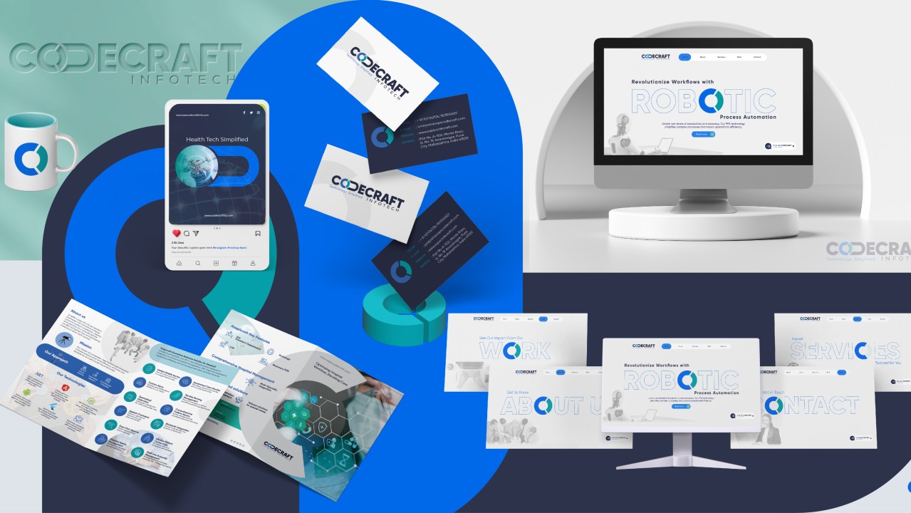
Admin / Nov 18, 2025Brand Identity Development for SAPS CodeCra

Brand Identity Development for SAPS CodeCraft Infotech LLP
SAPS CodeCraft Infotech LLP is an innovative company that specializes in providing cutting-edge technology solutions across various industries. From Warehouse Management Solutions and Pharmacy Retail Billing Systems to Hospital Management Software, RPA Automation Projects with AI and ML, and E-Commerce Website and Mobile App Development, SAPS CodeCraft Infotech LLP stands at the forefront of digital transformation. As a trusted partner for businesses, the brand needed a comprehensive identity to reflect its expertise and values. This article explores the process of developing the brand identity for SAPS CodeCraft Infotech, including its logo, color palette, font selection, stationery, and website.
Logo Design: "OD" as the On/Off System
The cornerstone of CodeCraft Infotech’s brand identity is the logo, which prominently features the letters "O" and "D." These letters are designed to represent the on/off system of a button, a fitting symbol for a tech-driven company. The on/off switch concept resonates with the idea of activation, empowerment, and innovation—core principles that drive the brand's ethos.
- Symbolism: The "O" represents the button in its 'on' position, while the "D" is subtly integrated to suggest continuity and the concept of a stable, ongoing connection. This dual representation speaks to the company’s ability to create software solutions that 'activate' business ideas and 'maintain' long-term, dependable systems for clients.
- Colour Palette: The logo uses three primary colours:
- Font Choice: The choice of Gilroy Black for the brand’s typography underscores strength, modernity, and readability. The bold nature of the font complements the logo’s design and creates a visual balance that ensures the brand’s message is communicated clearly and confidently.
The logo design is more than just a visual symbol; it’s a representation of the technological prowess, the reliability, and the cutting-edge solutions CodeCraft Infotech offers its clients.


Stationery Design: Letterhead and Visiting Cards
The stationery set for CodeCraft Infotech was created to ensure brand consistency across all business communications. Every element was designed with attention to detail to uphold the visual integrity of the brand’s identity.

- Letterhead: The letterhead design seamlessly incorporates the logo, colour palette, and typography, ensuring that all formal communication carries the brand’s message. The layout is clean and professional, with enough space to allow for the content to take center stage, while still maintaining the brand’s strong presence.
- Visiting Cards: The design of the visiting cards reflects the modern, tech-focused nature of CodeCraft Infotech. The card’s sleek design features the logo prominently, paired with the company’s tagline, "Technology Signified," to reinforce the core message of the brand. The use of Bondi Blue and Blue Ribbon ensures the card feels vibrant yet professional, making it an ideal representation of the company’s identity.
- Brochure: The brochures were designed with the intention of providing a clear and visually engaging representation of the company’s diverse services. Every page was carefully crafted to highlight the unique offerings. The use of the color palette and typography from the brand’s visual identity ensured that the brochures not only conveyed information effectively but also reinforced the brand’s professionalism and innovative approach. This attention to detail in the brochure design helped create a cohesive and compelling narrative for the company’s target audience.

Website Development
The website for SAPS CodeCraft Infotech LLP was developed to serve as an interactive and engaging digital presence for the brand. The design is consistent with the brand identity, utilizing the same colour palette, typography, and design principles as seen in the logo and stationery.
- User Experience (UX): The website is built with the end-user in mind, ensuring ease of navigation, responsiveness, and functionality. The layout is intuitive, with clearly defined sections that showcase the company’s services, expertise, and portfolio.
- Visual Elements: The site’s design reflects the modern, clean aesthetic of the logo, with the on/off button concept subtly integrated into various UI elements. The use of Bondi Blue, Blue Ribbon, and Martinique across the website creates a cohesive experience that aligns with the brand's physical identity.
- Content Strategy: The content on the website emphasizes the brand’s mission of delivering technological solutions that are both innovative and dependable. It communicates the company's vision and highlights its expertise in the coding and technology sector, reinforcing the tagline, "Technology Signified."


Conclusion
The brand identity development of SAPS CodeCraft Infotech LLP has been an exciting and rewarding process, resulting in a logo and suite of assets that clearly communicate the company’s core values. The integration of the on/off button concept into the logo, the modern typography, and the vibrant yet professional colour palette all come together to create a cohesive and powerful visual identity. Through this branding, CodeCraft Infotech is poised to make a strong impact in the tech industry, reinforcing its position as a reliable and innovative partner for businesses looking to harness the power of technology.